
Designer Diary: Quest Inc.
by Thiago Leite
“When designing auction games, you need to make the price of the auctioned item not super obvious!”
This was said to me by awesome game designer Sergio Halaban (of Sheriff of Nottingham and Quartz). At that time, I was far from really pursuing game design in any capacity; however, the phrase stuck with me for some reason, and would return to my mind years after…
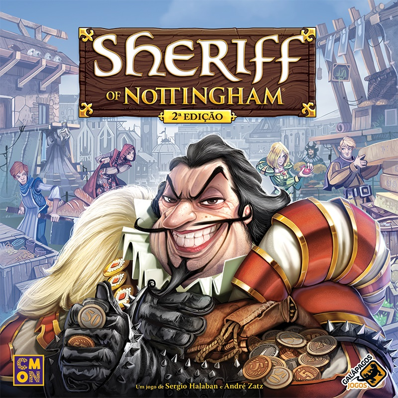
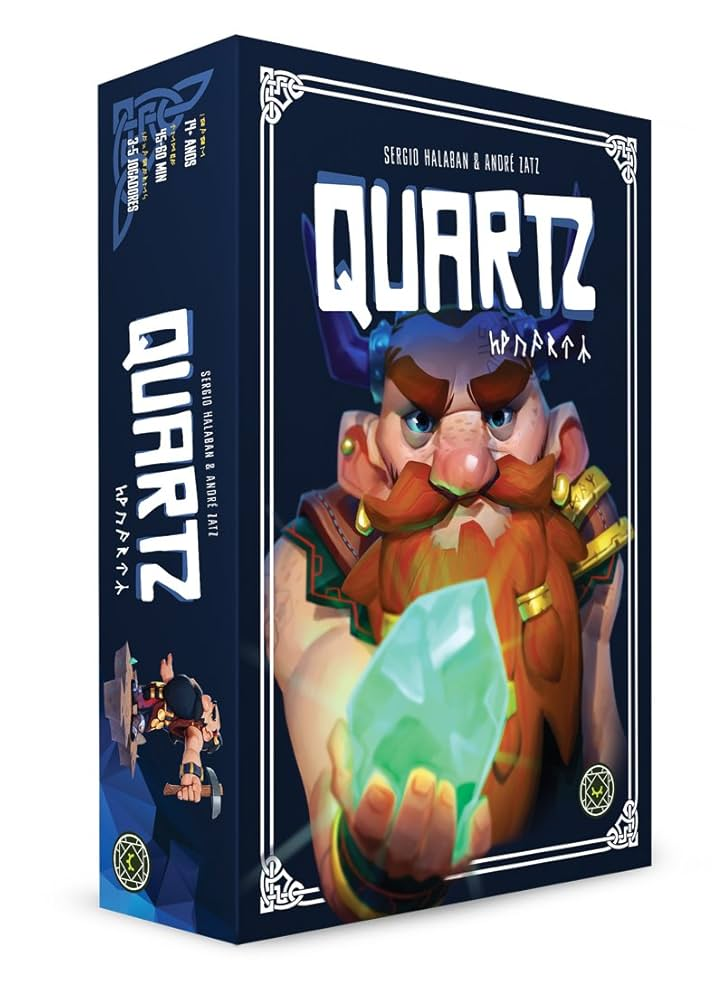
Some of Halaban’s games
But first, hello, let me introduce myself: my name is Thiago Leite. I’m a Brazilian food engineer and teacher, who worked for some years as a board game editor, rulebook writer, translator, and proofreader; and in recent years, I finally began to design games… Not that this was a recent desire: ever since I played my first 3 modern board games (that was Battlestar Galactica, Agricola and Puerto Rico) back in 2009, I always had some random thoughts at most random moments – little sparks of game ideas… “It might be fun If a game does that and that” or “Oh if I mix that theme in this particular setting, it might work” – but I never passed that point, and probably all those ideas were lost eventually.
Yeah, something like that…
A few years back, I had a boring 10-hour waiting time during a trip, and another of those sparks popped in my mind: “What if there’s a game where you manage the NPC characters of an electronic RPG who want to profit off of quests they give to adventurers?”. Unlike all those other ideas, that time I grabbed a piece of paper and started to doodle some cards, structure some rudimentary tables… 10 hours flew by, and looking at those pages I thought: “This might really work”.
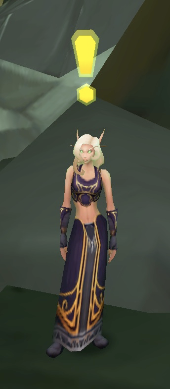
What if she wants to profit when giving that quest?
Speaking about that trip with a friend, we talked about that random game idea. He really liked the premise and encouraged me to really try to make it. At the time, however, all I had defined was the game’s theme: a parody of the RPG quest systems. I felt that this idea was weird enough that it would be a better fit than a serious take on RPG quests. I had no idea how to properly start to designing that game. A couple weeks after that talk, I was watching “Storage Wars”, a reality TV show about buying and selling random items salvaged from forgotten storage lockers. Another random thought occurred to me: “This show might work as a game”! Then, something clicked… I could mix those two ideas! I had the RPG parody as a theme, and now I had a core mechanic as well: auctions.
Yeah, THAT show…
I quickly adapted the initial storage mechanic idea into a pile of cards, where the “storage” would be an NPC who shows up with an issue, a quest, and quest rewards (loot). To emulate the “surprise factor” of the show, my original idea was to keep most cards hidden, but this soon proved to make the game too random. I then decided to make all quest loot visible from the get go… There was also the fact that, in the show, participants buy the contents of the locker, whereas in an RPG, a player character never buys a quest from an NPC. So I flipped the dynamic: instead of a player buying a quest, NPCs would offer to pay the players for complete their quests. Players, in reverse-auction style, would in turn bid to take on the quests for the least amount of money. As a bonus, that character tells the players about some loot that can be obtained during that quest.
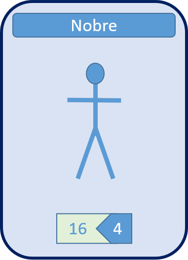
Early (and ugly) version of a citizen card: this character (a noble) offers 16 to deal with whatever problem was, and knows about 4 loot.
Thinking about Halaban’s quote, I created quest cards to be paired with those citizens cards: showing what players need to do in order to complete that quest, and also more loot. By combining those types of cards, I managed to generate a lot to be auctioned: Citizen + Quest + Loot cards. This ensured that the combinations would always be different from game to game.
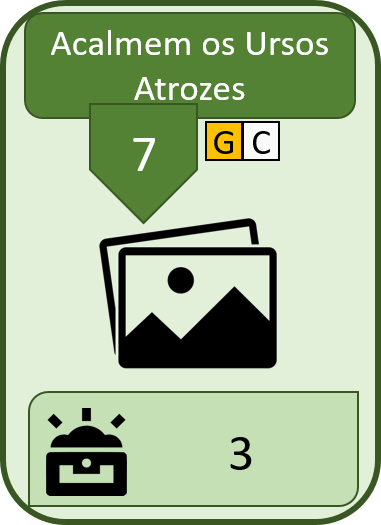
An early version of the “Soothe the Dire Bears” quest card, showing a difficulty of 7, party requirements of a G-Guerreiro (Portuguese for Warrior) and a C-Clérigo (Cleric), as well as 3 loot.
Time to playtest it.
By the time the game was ready for playtesting, it was social distancing time, and I was in at least two online board game testing groups. On those first playtesting, the reception was superpositive: that “reversed auction and theme” really caught people’s attention. However, Halaban’s phrase still echoed in my head. At that time, the loot had a fixed value, so a sword always gave 7 gold to the player that got it. It became ultimately very easy for players to know how much a “Character+Quest+Loot” combo was worth.
To account for this, I introduced a set collection mechanic to loot cards. This way, loot cards would have different perceived values to different players — i.e., loot contents could be interesting for both player A (who wanted a sword card from the loot) and player B (who wanted a food card from the same loot). This made the auction phase even more dynamic! I experimented with some kinds of set collections, keeping them somewhat similar to each other (I didn’t want too many edge cases).
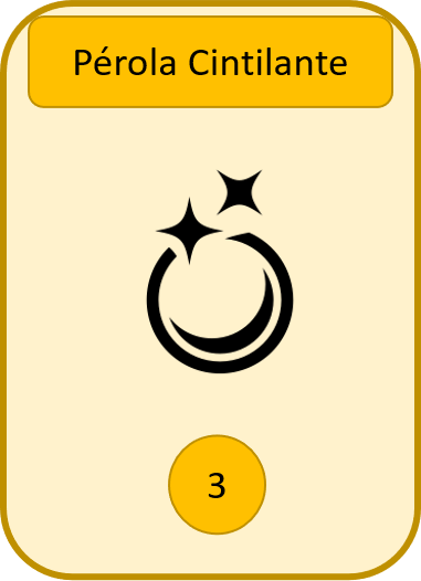
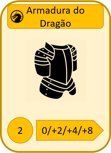
Early loot (left) had only the coin value; the second wave of loot cards (right) presented a set collection element.
To take that dynamic perception of value even further, after the phase in which players auctioned for the quest, now they needed to visit the city in order to pay heroes to deal with the quests. Other than balancing values, this phase has had almost no changes from the initial idea, where players should have another type of interaction besides the auction. In this phase, a player chooses a location to visit (such as a tavern, a potion shop or a guild house) and there they pay off some heroes and/or use a special action associated with that location (such as buying a beer (that can improve a strength of a party), a potion that allows the player to not discard a hero, or use the favor of the guild to buy more than one hero of the same class at once). Almost all heroes have classes inspired by Dungeons & Dragons, with tropes such as warriors, mages, clerics and rogues, and even multiclass heroes. There are also strength and price variations between them.
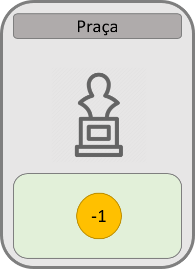
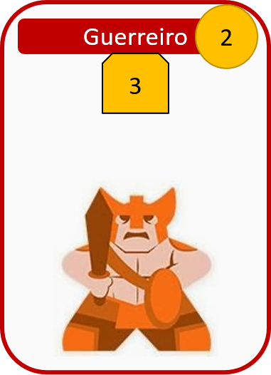
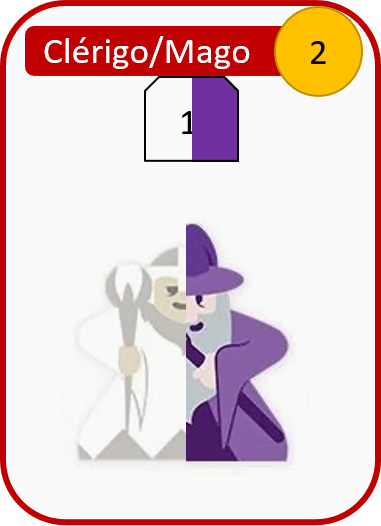
Early version of the Town square (left – the effect is still the same from the first playtest), a Warrior (center – with a cost of 2 and a strength of 3) and a multiclass Cleric+Mage (right – with a cost of 2 and a strength of 1).
I always wanted to ensure that the earlier players get to these locations, the more hero options they get. To achieve it, players also auction the order in which they visit the city, but NOT in a new auction phase. Instead, while players bid for the first combo (citizen + quest + loot cards), they also bid for the order token. The first lot of cards has the order token #1: the lowest bidder gets some money (possibly – because he can offer to do that quest receiving no money), a quest to handle, loot to win in the future, as well as first dibs at visiting the city. This adds another layer of value to that lot: even if lot #1 isn’t that good, being the first one in town could help players deal with quests auctioned in past turns.
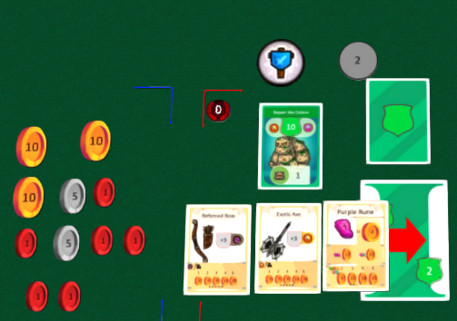
This player got some money from the citizen, the quest card, and some loot. As this was the second lot in the round (marked by Order Token #2 on the top right), the player is the second one to visit the city – Image taken from an online playtest using Tabletopia.
After a positive reception in an online event called ProtoBR, I decided to present the game to Diego Bianchini (from the Brazilian publisher MeepleBR and their studio Glyptodon). He and the rest of their crew instantly liked the concept and the game. The contract came soon, I signed my first game (that would be the second to be published, but that is another story) and the name was never questioned: Quest Inc. would become a reality soon! After signing, the game went on a few rounds of fine tuning, especially with regards to loot/set collection values and refinements in the 2-player mode.
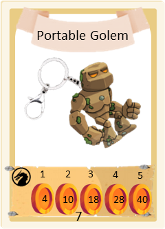
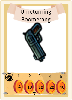
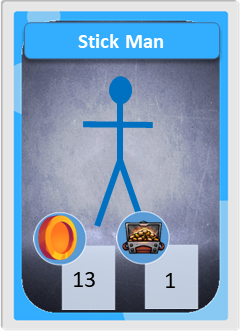
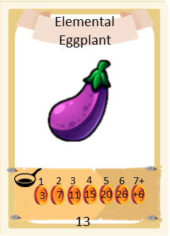
These are some of the cards, after the final wave of balancing.The publisher also believed that the game should have a humorous tone, so the final artwork was further changed.
And then we began to search for an illustrator. I always envisioned the game to have a cartoony art – despite not having a lot in common with my game, Munchkin has a similar tone and art mood. Another inspiration was the work of Luis Brueh, a fellow Brazilian designer (who also illustrates his games). This is when I saw the work of Denilson Silva, in a Sergio Halaban (yes, him again!) game called “Quartz: the Card Game” – the style was so fitting to what I had in mind for Quest Inc. MeepleBR contacted Denilson and he was pumped right there.
Collaborating with Denilson was really fun; I have some jokes that I wanted to include in the game since the first prototype, and he also contributed with many ideas of art and/or names for items and quests (such as the objects wrecked by the dire reindeer). Many items have puns in their name that drove Denilson’s creative process, while some took the opposite path: Denilson made art based on a loose description and I had to come up with a pun-intended name, with which I got invaluable help from my dear friends.
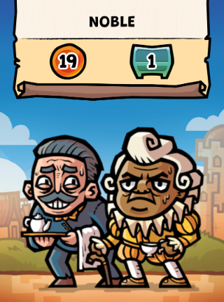
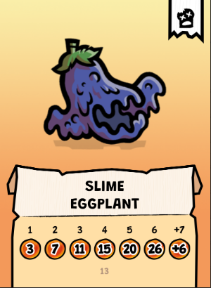
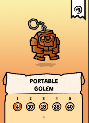
What an evolution!
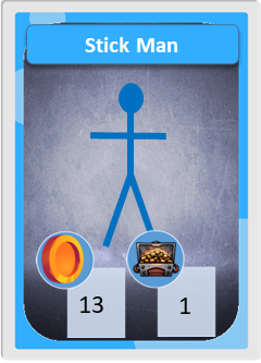
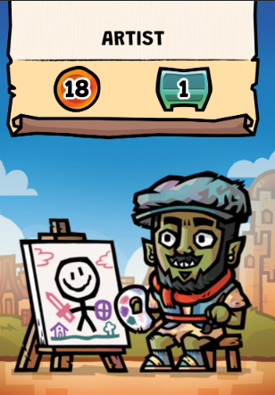
In this one I asked for a self-portrait of Denilson… he nailed it!
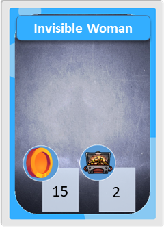
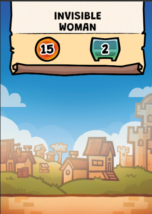
Well, except for the art from this card! Before and after the only card art that I “made”!
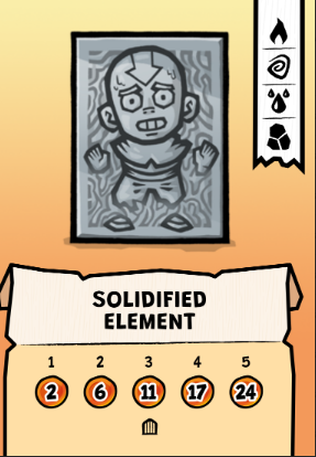
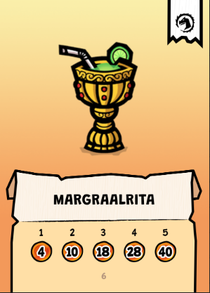
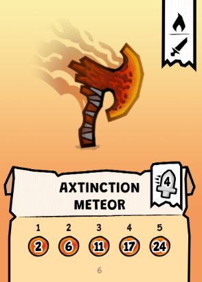
A special thanks to Simone, Mr. Hercules, Renato Lopes, Brad Smith and Gustavo Oliveira, for both Portuguese and English wacky names for so many cards. I had to be honest that part of the journey was really enjoyable!
At that time, Diego did a really good job improving the game as a product, asking me what components we could upgrade – this is when the clock disc and wooden companies’ plaques were created. Formerly, they were tokens, but they were changed to a disc with a rivet and nicely printed wooden markers. The company cards also got characters, names and flavour texts (with which I got huge help from my girlfriend, Simone). This was another thing I put my creativity to work on, and it was brought to a great level by Denilson’s art – your art is awesome, dude!
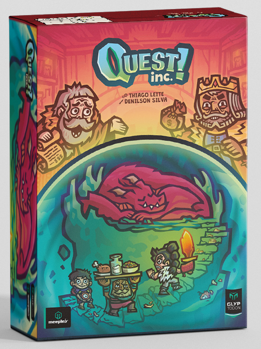
The final art cover is amazing!
Unfortunately, the rulebook was tight, and my “thank you” section was a little longer than it perhaps should have been, but I think this diary helps to fill that gap. I name-dropped many dear friends who were important on some level to make this game become a reality. Also, in the art, Denilson helped me bring many references: some are more obvious, others are more subtle, serving as homage to people that I care about, and/or games that were part of my professional life inside the board game industry and/or personal life.
I have probably thanked these people in person, but I might include here some with whom I haven’t talked about yet and helped a lot during many phases: Guilherme Duque, Moises, Bianca and Jairo (and everyone from the Playterça testing group) and Cabelinho, Gabriel Toschi, Fernando Cunha, Yuri Morroni, Bruno Sia (and everyone from OPON testing group), Santiago and Malveira, André Teruya, Danilo Valente, Andressa Farias, Rennan Gonçalves, and Michael Alves.
To wrap it up: I tried to design a game with simple rules and great player interaction, but more importantly, I tried to design a game that I enjoy playing, and luckily I enjoyed every time that I have played it. If everyone that plays this game feels a fraction of what I felt creating it, I’d be a happy and accomplished game designer.